
Houston Design System
I built Eduzz's Houston Design System from the ground up — tokens, components, and the build standard for product teams.



Context
Eduzz is a full platform for monetizing knowledge, with products spanning online course creation (Nutror), business management (Orbita), ticket sales (Blinket), checkout (Checkout Sun), and community (Space).
The portfolio grew fast, and design didn't keep up with structure. For a company selling digital products, a fragmented experience across platforms isn't aesthetic noise — it's a trust problem. Giving design a foundation became a condition for scaling without multiplying the chaos.
Problem
Each product made design decisions in isolation. Without a single source of truth, every delivery started from scratch.
The base was Google's Material Design, hardcoded straight into the codebase, with no tokens or reuse across teams.
- Hand-coded components, generating variations even within the same product.
- Divergent iconography across platforms, with no criteria.
- Users felt like they were in different products from the same company.
- The business carried constant rework and stalled scale.
Process
In the early phases, decisions were made together with design leadership. From the architecture stage on, I acted as UI Designer, focused on building the design system itself: it was on me to decide the structure and validate every contribution.
Diagnosis
Principles
Foundation
Components
Handoff
Test
Solution
The answer was a layered system — tokens, components, documentation, iconography, and navigation — sustaining coherence across the whole platform.
Layered architecture
Map of Houston's documentation, organized into four major layers.
a. Foundations
- a1. About Houston DS
- a2. Architecture
- a3. Tokens
- a4. Grid
b. Libraries
- b1. Icons
- b2. Illustrations
- b3. Core components
- b4. Templates
- b5. Help components
- b6. Team components
c. Handoff
- c1. Core components
- c2. Team components
d. Others
- d1. Zeroheight
- d2. Github
Tokens as foundation
Each product had its own variations of color, typography, and spacing — some deliberate, others accumulated hardcode. Organizing this base was one of the most complex parts of the project: generic enough to serve everyone, specific enough to preserve each product's identity.
Tokens don't show up on screen, and the team wanted to see components first. I prioritized them anyway: without this foundation, every color or typography adjustment would turn into find-and-replace across dozens of files.
- Color
- Typography
- Spacing (squish and stack)
- Border
- Shadow
- Opacity
50+ components
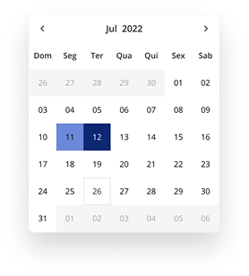
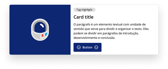
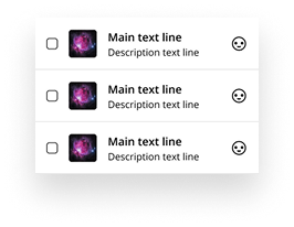
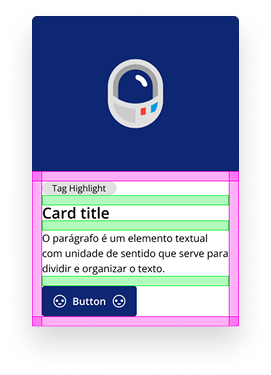
I followed the atomic design order: atoms first — button, field, icon — then molecules combining them, and only then more complex organisms.
Illustration library
A curated bank of illustrations, customized to each product's color. Used in error screens, empty states, and other supporting moments, like onboarding.
Writing guide
Each product wrote errors, success messages, or tooltips its own way. The writing guide extended the same governance from icons to words: brand tone of voice and a microcopy standard per component type — error and success messages, buttons, labels, tooltips, toasts, dialogs.
Documentation
All design documentation lived in Zeroheight — usage rules, anatomy, content. A component was only "done" once published on Github and documented in Zeroheight.
 Figma
Figma
 Github
'%3e%3cpath%20d='M14.295%2012.7955L62.988%209.19895C68.9694%208.68591%2070.5058%209.03175%2074.267%2011.7659L89.8104%2022.7158C92.3738%2024.599%2093.2274%2025.112%2093.2274%2027.1624V87.2162C93.2274%2090.98%2091.8608%2093.2064%2087.0762%2093.5461L30.531%2096.971C26.9406%2097.1409%2025.2307%2096.6278%2023.3502%2094.2316L11.904%2079.3473C9.85096%2076.6078%209%2074.5574%209%2072.1603V18.7795C9%2015.7022%2010.3666%2013.1361%2014.295%2012.7955Z'%20fill='white'/%3e%3cpath%20fill-rule='evenodd'%20clip-rule='evenodd'%20d='M62.988%209.19983L14.295%2012.7964C10.3666%2013.1361%209%2015.703%209%2018.7795V72.1603C9%2074.5566%209.85096%2076.607%2011.904%2079.3473L23.3502%2094.2307C25.2307%2096.6269%2026.9406%2097.1409%2030.531%2096.9702L87.0771%2093.5469C91.8582%2093.2064%2093.2283%2090.98%2093.2283%2087.2171V27.1633C93.2283%2025.2185%2092.4601%2024.6579%2090.1985%2022.9982L74.267%2011.7659C70.5067%209.03175%2068.9694%208.68591%2062.988%209.19895V9.19983ZM31.8096%2026.1803C27.1922%2026.491%2026.145%2026.5614%2023.5226%2024.4291L16.8558%2019.1262C16.1782%2018.4398%2016.5187%2017.5836%2018.2259%2017.4129L65.0358%2013.9923C68.9667%2013.6491%2071.0136%2015.0193%2072.551%2016.2161L80.5792%2022.0329C80.9224%2022.2062%2081.776%2023.2297%2080.749%2023.2297L32.408%2026.1398L31.8096%2026.1803ZM26.4266%2086.7041V35.723C26.4266%2033.4966%2027.1104%2032.4697%2029.1573%2032.2972L84.68%2029.0465C86.5632%2028.8766%2087.4142%2030.0734%2087.4142%2032.2963V82.9377C87.4142%2085.1641%2087.071%2087.0473%2083.9971%2087.2171L30.8654%2090.2971C27.7915%2090.467%2026.4275%2089.4435%2026.4275%2086.7041H26.4266ZM78.8746%2038.4563C79.2152%2039.9963%2078.8746%2041.5363%2077.3346%2041.7123L74.7738%2042.2201V79.8603C72.5501%2081.0571%2070.5032%2081.7409%2068.7925%2081.7409C66.0583%2081.7409%2065.3754%2080.8846%2063.3277%2078.3203L46.5813%2051.9731V77.4641L51.8789%2078.6635C51.8789%2078.6635%2051.8789%2081.7435%2047.6047%2081.7435L35.8215%2082.4273C35.4783%2081.7409%2035.8215%2080.031%2037.0157%2079.6905L40.093%2078.8369V45.1329L35.8224%2044.787C35.4792%2043.247%2036.3328%2041.0233%2038.7264%2040.8508L51.3694%2039.9998L68.7934%2066.6876V43.0772L64.352%2042.5668C64.0088%2040.681%2065.3754%2039.3108%2067.0826%2039.1436L78.8746%2038.4563Z'%20fill='black'/%3e%3c/g%3e%3cdefs%3e%3cclipPath%20id='clip0_423_11343'%3e%3crect%20width='88'%20height='88'%20fill='white'%20transform='translate(9%209)'/%3e%3c/clipPath%3e%3c/defs%3e%3c/svg%3e) Notion
Notion
'/%3e%3cpath%20d='M79.854%2063.1737L87.7672%2055.2605L49.5808%2017.0741L41.6677%2024.9873L71.8856%2055.2052L41.6677%2085.4231L49.5809%2093.3363L79.7988%2063.1184L79.854%2063.1737Z'%20fill='url(%23paint1_linear_421_11256)'/%3e%3cpath%20d='M19.4448%2028.89H30.634V81.1139H19.4448V28.89Z'%20fill='url(%23paint2_linear_421_11256)'/%3e%3cpath%20d='M19.4448%2084.9407H30.634V93.3326H19.4448V84.9407Z'%20fill='url(%23paint3_linear_421_11256)'/%3e%3cdefs%3e%3clinearGradient%20id='paint0_linear_421_11256'%20x1='49.4457'%20y1='15.5563'%20x2='17.5003'%20y2='88.3363'%20gradientUnits='userSpaceOnUse'%3e%3cstop%20stop-color='%23F87B2F'/%3e%3cstop%20offset='1'%20stop-color='%23ED4574'/%3e%3c/linearGradient%3e%3clinearGradient%20id='paint1_linear_421_11256'%20x1='49.4457'%20y1='15.5563'%20x2='17.5003'%20y2='88.3363'%20gradientUnits='userSpaceOnUse'%3e%3cstop%20stop-color='%23F87B2F'/%3e%3cstop%20offset='1'%20stop-color='%23ED4574'/%3e%3c/linearGradient%3e%3clinearGradient%20id='paint2_linear_421_11256'%20x1='49.4457'%20y1='15.5563'%20x2='17.5003'%20y2='88.3363'%20gradientUnits='userSpaceOnUse'%3e%3cstop%20stop-color='%23F87B2F'/%3e%3cstop%20offset='1'%20stop-color='%23ED4574'/%3e%3c/linearGradient%3e%3clinearGradient%20id='paint3_linear_421_11256'%20x1='49.4457'%20y1='15.5563'%20x2='17.5003'%20y2='88.3363'%20gradientUnits='userSpaceOnUse'%3e%3cstop%20stop-color='%23F87B2F'/%3e%3cstop%20offset='1'%20stop-color='%23ED4574'/%3e%3c/linearGradient%3e%3c/defs%3e%3c/svg%3e) Zeroheight
Zeroheight
Rollout and adoption
Adoption doesn't come bundled with documentation. It took bringing the system to the team: teaching its use and following up on day-to-day application.
Workshops with the design team, accessible documentation, and active presence in reviews to validate the application of the standards.
In Figma, onboarding was hands-on: I showed how to consume the library's components and how to create team components when a product had a need the core didn't cover.
Results
Despite the results it had been delivering, the company's new leadership chose to discontinue Houston, adopting a different direction. During iterations with the designers and developers who used the system, we reached numbers worth recording:
-
7 Products adopted the system
-
−30% Handoff time
-
−25% Prototyping tasks
-
+30% Screen development
-
2 days Front-end for a POC