
Locaweb E-commerce Redesign
A platform with no update since 2015. Two pages redesigned. In July 2025, the first month with the new PDP live, hosting plans sold climbed back to around 3,000 — a mark not reached since Black Friday in November 2023.
Context
Locaweb is a Brazilian leader in technology and digital services — cloud infrastructure, hosting, and complete e-commerce solutions.
When it acquired KingHost, a company in the same sector, Locaweb decided to segment service: KingHost kept the technical audience; Locaweb kept SMEs — non-technical founders running their own business.
Problem
The e-commerce hadn't kept up with that shift: with no meaningful update since 2015, the interface was still designed for the old technical audience, solving with a short corridor between product, price, and purchase — it met users with exactly what they needed and went straight to conversion. Right for someone who already understood infrastructure. Except that wasn't Locaweb's audience anymore.
The audience Locaweb now prioritized needed the opposite. These non-technical founders needed to see where the product helped their business before comparing plans or decoding technical terms. For that discovery stage, the interface offered nothing.
Process
The project ran in stage-gate mode — each phase only moved forward after a committee validated the previous one. However, new directors joined the company and brought new direction for the project.
The start
Change
Two phases
Solution
The platform drove people toward purchase, but didn't help users understand before buying — and that stage, discovery, was exactly what the new audience needed most. Five days weren't enough to safely design the final screen — the bigger risk was getting the architecture wrong, not the aesthetics. I separated the conversations: wireframes to validate structure, a separate moodboard for visual direction. I traded impact in the approval meeting for validating the essentials first.
Information architecture
In the first and second fold I organized four points:
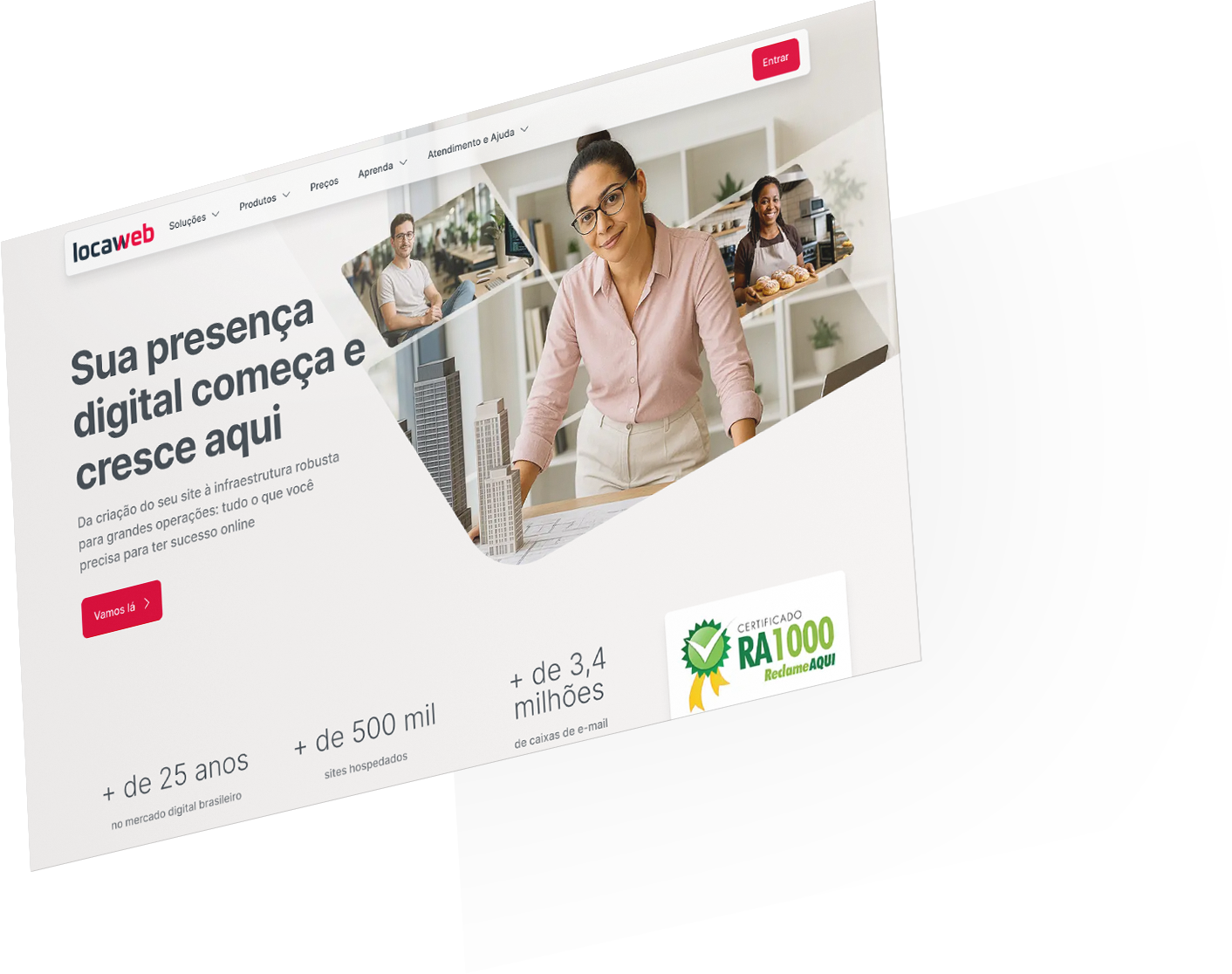
- In the header, the menu was regrouped by intent, with the Solutions group presented before Products.
- Initially, the hero block presented the value proposition anchored in the target audience's needs. But the space can also be used to highlight a campaign or product launch.
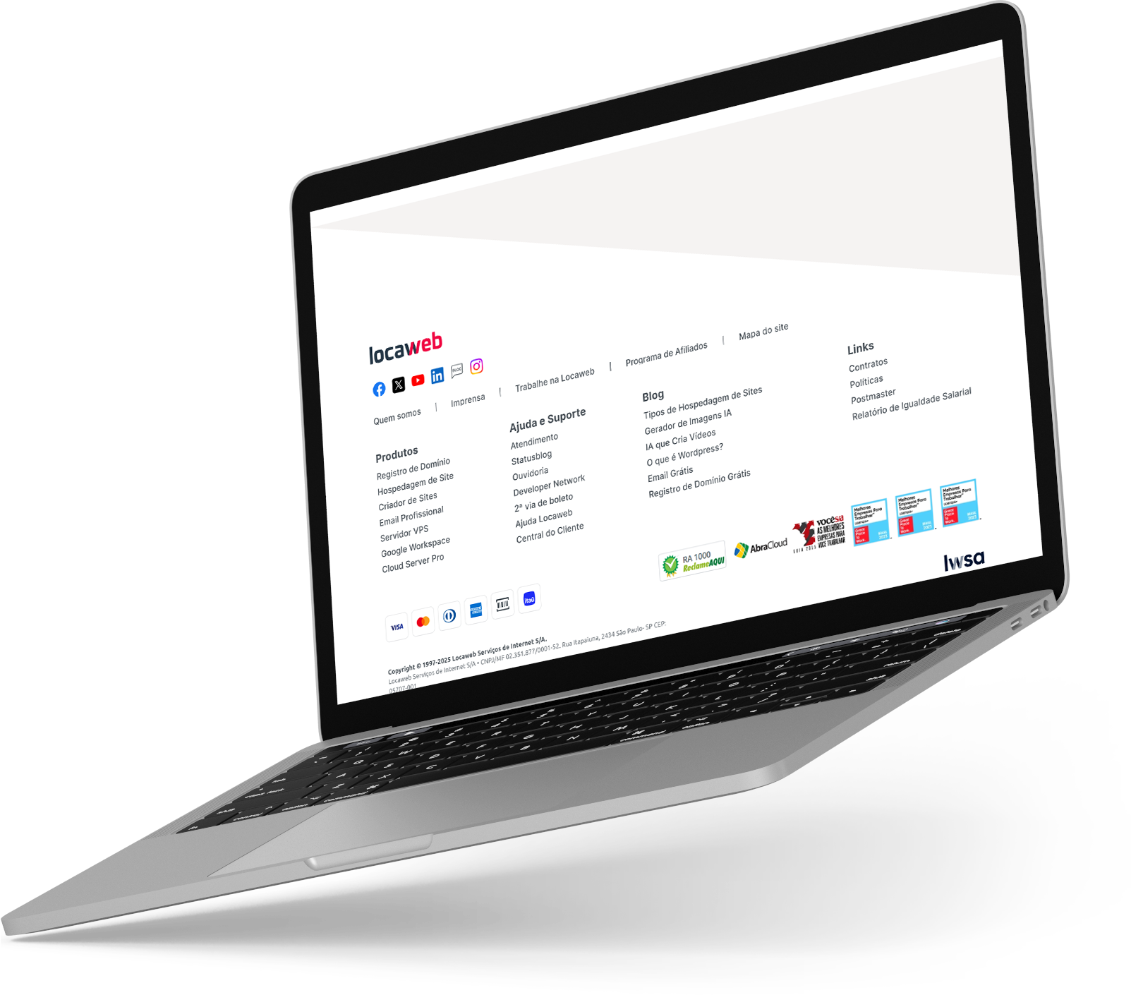
- The company's key numbers and the RA1000 seal, placed right below the hero block — social proof that reduces distrust for anyone who doesn't yet know the brand.
- A new product block, which directs the visitor to the right product depending on where their business stands.
Image direction
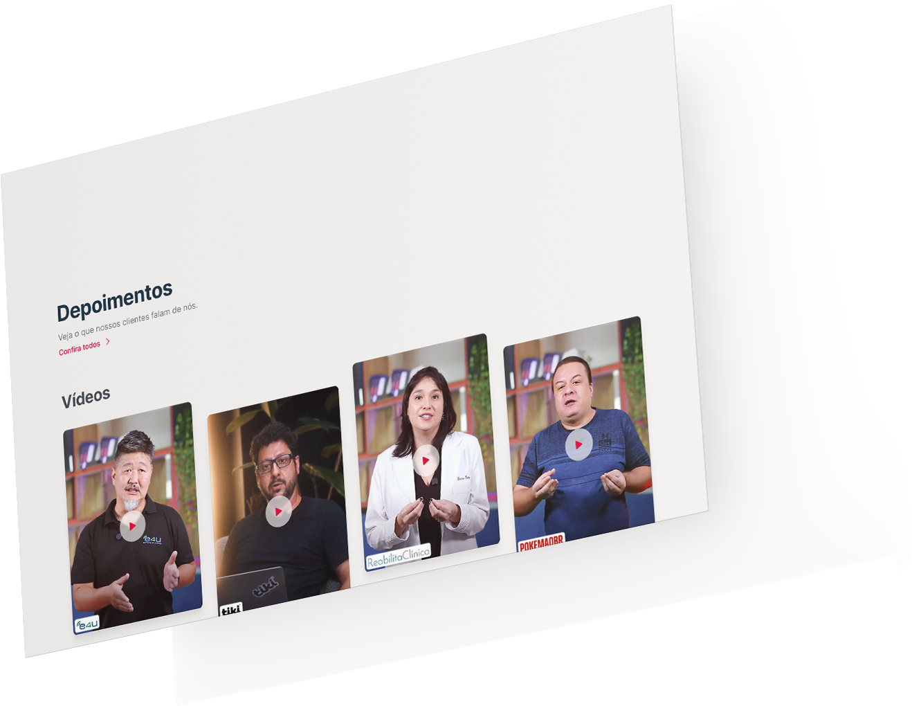
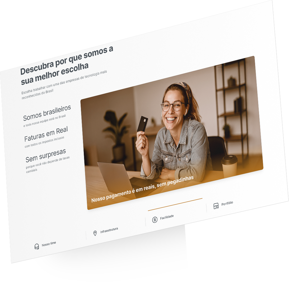
For the e-commerce, I prioritized photography of recognizable settings — the bakery, the small office, the studio — over illustration: this audience calls for a concrete scene, not a symbol. Most images were AI-generated, as long as they faithfully represented the client's type of business; exceptions use real people — Locaweb employees in the help section, clients in the testimonials.
Responsiveness
My investigation into user behavior showed that, over one year, mobile access grew 21% of sessions.
The most critical points were:
- The main navigation, in the header.
- Plan comparison, on the product page.
- Technical specifications table.
Accessibility
With the code ready, a developer ran the old and new home pages through AccessMonitor (the Portuguese government's WCAG 2.1 evaluator).
Design system
Perhaps the hardest choice in the project: building the foundations of a design system before the development team started coding the screens — tokens that became components, and components that combined into blocks ready to assemble a page. All that extra effort kept technical debt from piling up: at some point maintenance would become a nightmare, and by then it would be too late to refactor, because there would always be more screens to deliver.
Results
In July 2025, the first month with the new PDP live, hosting plans sold climbed back to around 3,000 — a volume that, until then, only Black Friday in November 2023 had reached. August confirmed it: the first full month, with no promotion, and the gain held. To isolate the effect of the design from seasonal variables, I compared August against the average of non-promotional months that year:
-
+13% in average sales volume
-
+9% per business day — the more conservative cut, which neutralizes the difference in business days between months
Impact on the company
The foundation paid off. After Phase 1, we kept designing the remaining product pages — myself and two other designers —, all on the same architecture, the same tokens, and the same visual language. Each new page cost a fraction of the first: exactly the return that betting on a design system, instead of hardcoding, had predicted.
Institutional adoption
Adoption went beyond the product. The e-commerce design system was incorporated as a chapter of Locaweb's corporate design system — it stopped being a standalone initiative and became an official part of the company's system. And the image production guide, with its visual tokens, started being used by marketing.